HfMDK Frankfurt Online
#1. About the projcet
On website and application, I tried to show the information in a very clear and minimalistic way. I wanted to show what’s important for the students and the public who will use the site.
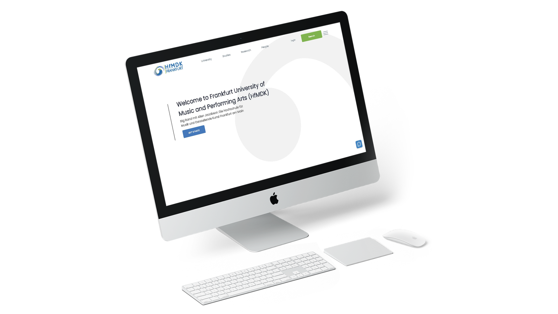
I saw that my online design should be cooler so it’s easier for the eyes that’s why I used the blue colour logo. I also used the same colour as the logo on the button to keep everything simplistic and to direct the user as to where they should click.
#2. Creative Ideas
I place the search bar at the top to speed the process of the user wanted to look for something specific. I used some icons to explain what the University have.
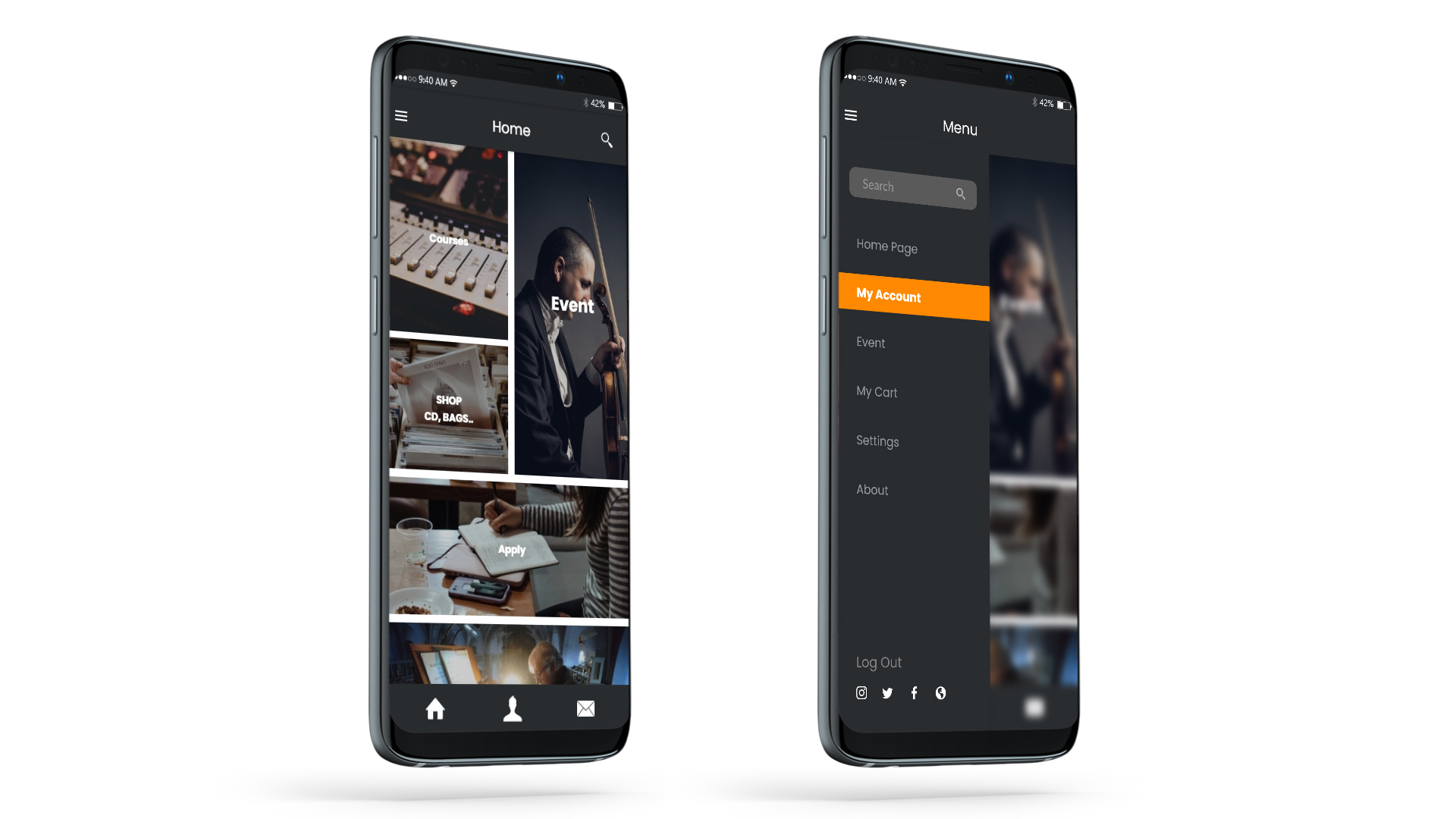
It help create the clear message and user experience I wanted to make. I used some photos and they can drag on to them to see more, this is used for apply, study and visit.
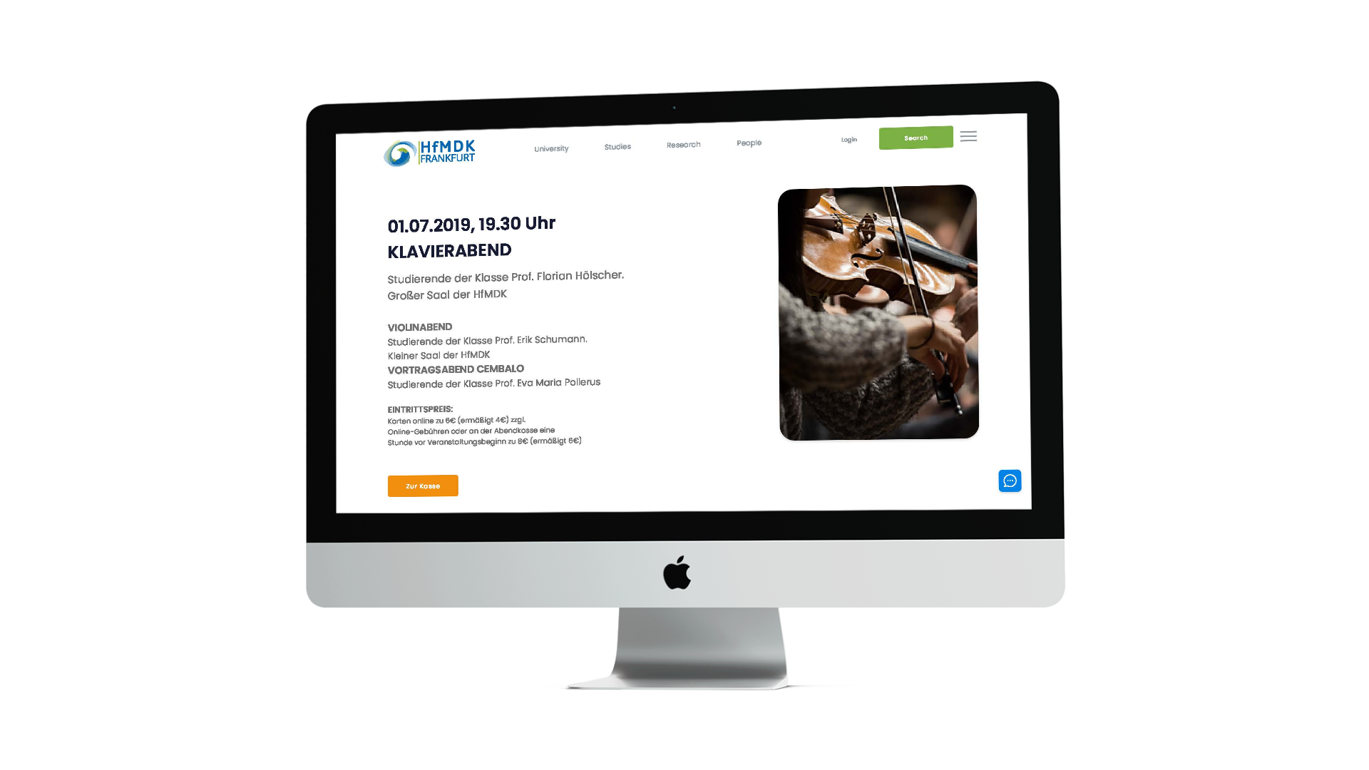
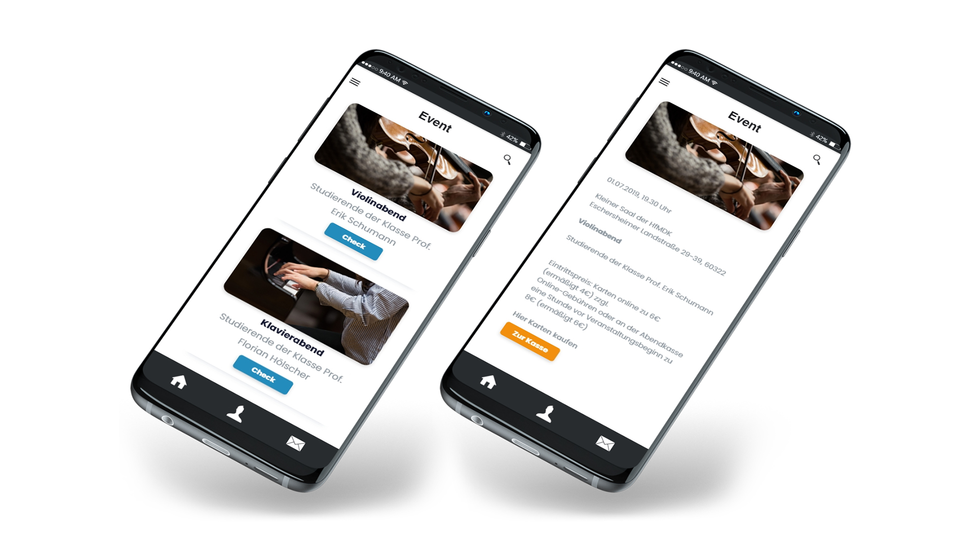
I created a part where the professors recommend various up coming event. The user can choose one of the first 3 events or they can click on the button.
Displayed in the header is more information about everything you need to find about the university.
for more details you can check the Corporate Identity on HfMDK